mirror of https://github.com/exacti/Toast.git
Toast - A Bootstrap 4.2+ jQuery plugin for the toast component
https://github.com/exacti/Toast
You can not select more than 25 topics
Topics must start with a letter or number, can include dashes ('-') and can be up to 35 characters long.
|
|
7 years ago | |
|---|---|---|
| css | 7 years ago | |
| dist | 7 years ago | |
| js | 7 years ago | |
| README.md | 7 years ago | |
README.md
Toast
A jQuery plugin to make the usage of Bootstrap 4 toasts easy.
About
As of Bootstrap 4.2, toasts have been inroduced and the aim of this plugin is to make it easier to use them.
Usage
You can pass to $.toast an object with the settings for your toast and the settings are as follows:
| Parameter | Description | Default | Values |
|---|---|---|---|
| title | Shows in the top left corner of the toast | 'Notice!' | |
| subtitle | Shows in the top right corner of the toast | N/A | |
| content | Show in the toast body | N/A | |
| type | Determines the style of the toast based on Bootstrap styles | 'info' | 'info', 'success', 'warning', 'error' |
| delay | Determines how the toast will show for | 3000 |
Note: If content is omitted, the toast will not have a .toast-body and can be used as a small toast which will be shown below in the examples.
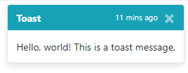
$.toast({
  title: 'Toast',
  subtitle: '11 mins ago',
  content: 'Hello, world! This is a toast message.',
  type: 'info',
  delay: 5000
});
The respective markdown for the above would be:
<div class="toast" role="alert" aria-live="assertive" aria-atomic="true" data-delay="5000">
<div class="toast-header bg-info text-white">
<strong class="mr-auto">Toast</strong>
<small class="text-white">11 mins ago</small>
<button type="button" class="ml-2 mb-1 close" data-dismiss="toast" aria-label="Close">
<span aria-hidden="true" class="text-white">×</span>
</button>
</div>
<div class="toast-body">Hello, world! This is a toast message.</div>
</div>
To show a "snack" (a small version of the toast), simply omit the content property:
$.toast({
  title: 'A small bitesize snack, not a toast!',
  type: 'info',
  delay: 5000
});
Now, onto the different types:
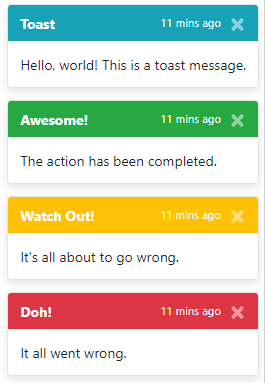
An 'info' toast
A 'success' toast
A 'warning' toast
An 'error' toast
The toasts are stackable:
Caveats
- The toast will remain in the DOM when hidden, I am working out a way to incorperate removing them from the DOM or reusing existing ones if left in, however, for the time being, you can use the following to remove the toast once it is hidden from the DOM:
$(document).on('hidden.bs.toast', '.toast', function (e) {
    $(this).remove();
});
Roadmap
- Allow img in toast as in shown in the Bootstrap 4 documentation
- Allow the option to prevent stacking
- Allow the open to keep / remove from DOM


